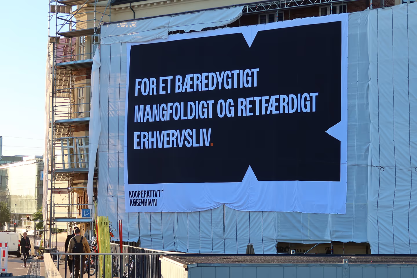
Identity for the business community's activist voice
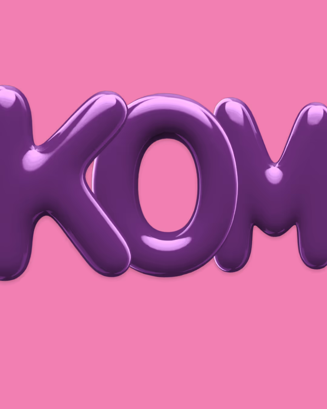
A simple website is not always simple to make. A lot of (new) things have to add up, come together, and align with each other. Fortunately, KK was totally on board with the idea that it could all "take up a bit more space," so it was allowed to. And oh yes, a little quirk and wooow came along too — because that's also part of wanting something different. It's damn fun at KK.
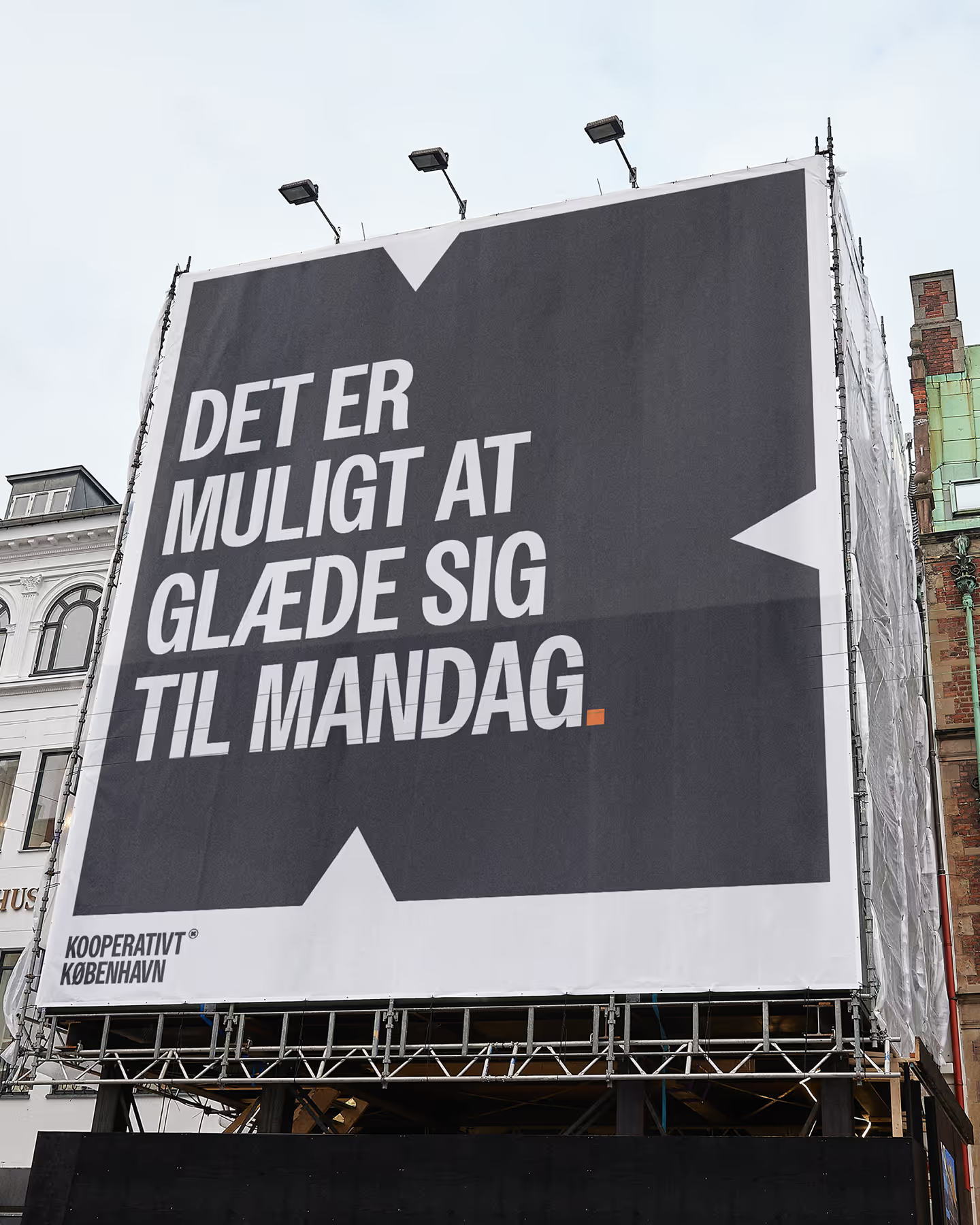

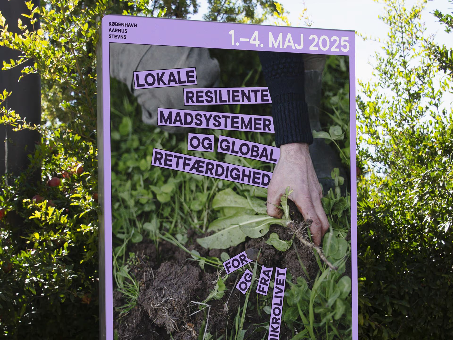
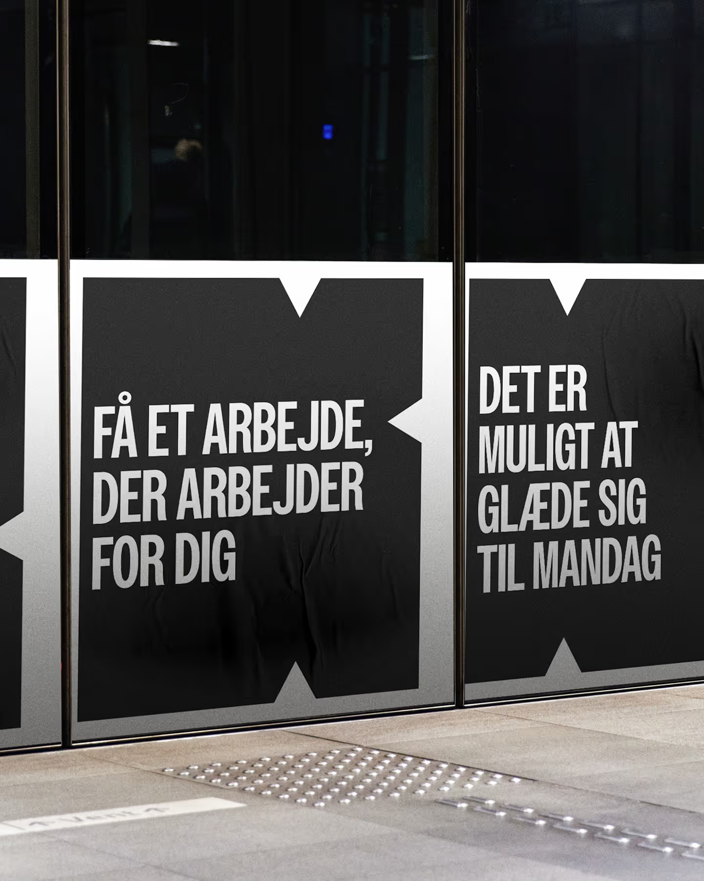
When we started Public Service, we didn't know we were building a cooperative. But one cold winter's day, with a little help from someone (thanks, Claus Skytt), we ended up at a member meeting in Nørrebro. And what a relief that was. Wow. We weren't alone in wanting to be in business with activist ambitions, uncompromising standards, and an entrepreneurial spirit. We joined immediately and suddenly felt a whole lot less alone. That's why it was also extra wonderful to be asked if we would help the organization with a visual identity, brand book, and new website. An identity that must dare. Dare to make noise, take up space, and insist. And it's a fine balance, because it must also invite, motivate, and inspire.
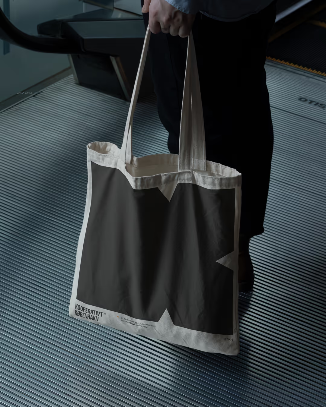

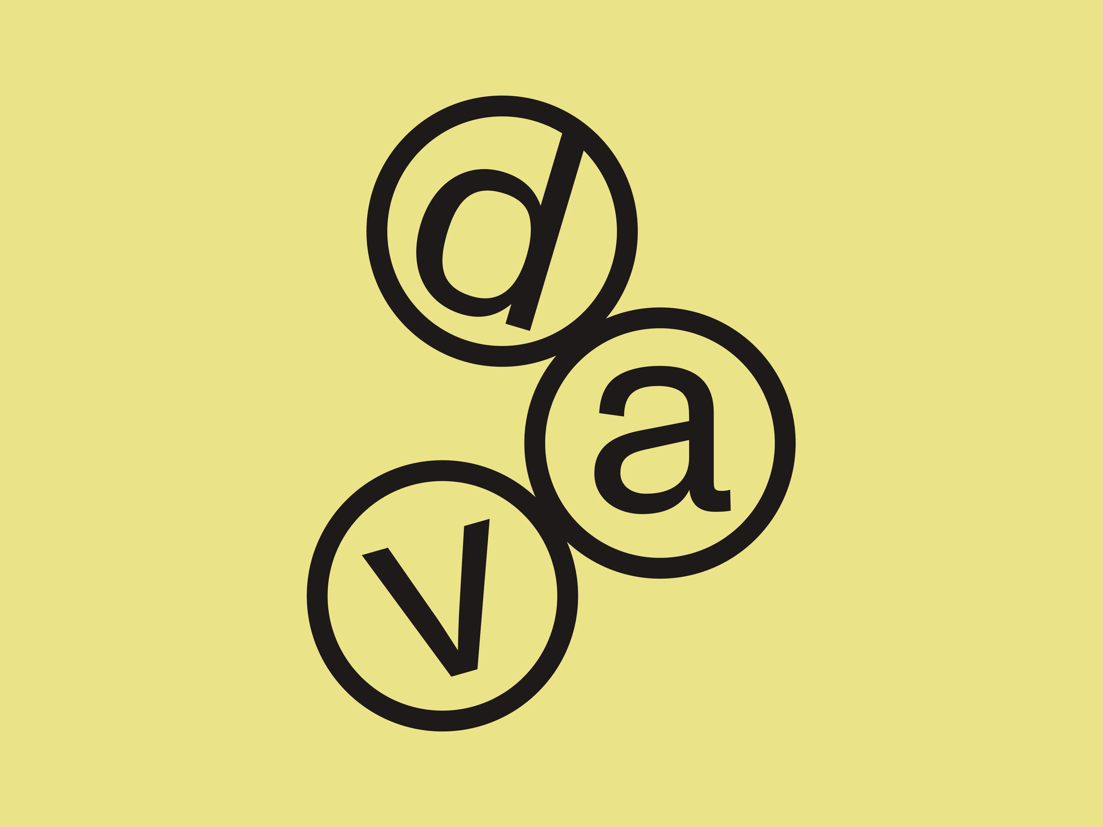
And then there was supposed to be something "if you know, you know". Which turned into a small emblem that all 60 members have received, and which can now be used instead of other c's, r's and whatev'ers. For us, it has quickly found its place in presentations and common phrases.


Credits
Creative Direction
Sophie Gevind
@sophiegevind
Design Direction
Nathalie Golde Sørensen
@nathalie_golde
Project Direction
Sarah Marie Thomsen
@sarahmariet
Graphic Design
Laura Villumsen
@lauravill_design
Digital Director
Oskar Martinussen
@oskarmartinussen
Digital Design
Emilie Bichel
@emillebichel
